Archives
-
Off to [Smaller] and Better Things
I resigned my position at StudentCity, my employer for the last 4 years. As of October 17, 2011, I work for McDougall Interactive, a digital/search marketing company in Danvers, MA. I'm sad to leave my friends and colleagues at SCC, but I'm excited for what's ahead for me with McDougall.
-
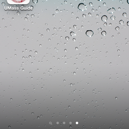
UMass Amherst iPhone App
In August, I reviewed an iPhone app for the University of Massachusetts Amherst, called "UMass Guide." The app is great. It's an excellent idea and it will be very helpful to students & UMass community members.
-

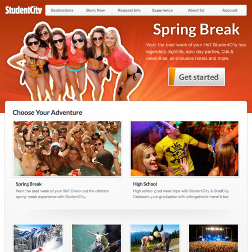
Designing Spring Break
I've spent the last 6 months working on a major update and redesign of StudentCity's Spring Break Destinations section. It taught me a lot about design, usability, user experience, and corporate culture.
-

Bad Road Sign Usability
Roads & highways are a great example of where usability really matters. The success of the highway system lies in its consistency. In all 50 states, highway signs are identical. Drivers don't guess or interpret. They just use.
-
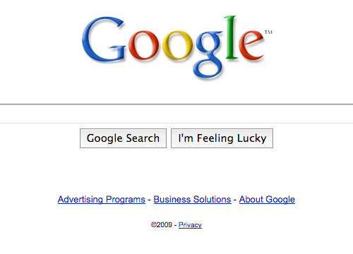
Google's Interface Changes
I'm not really a fan of Google's latest design changes. Increasing the size of the text-input seems fine, but the new buttons are atrocious. The biggest difference is the font-size on the buttons. But, with Firefox 3.5 on Mac OS X, the default crystal-themed buttons can only get so big.
-
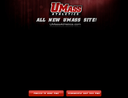
UMass Athletics Website Critique
The UMass Athletic Association just unveiled their new website. I’m not particularly impressed. I’ve listed a few constructive criticisms that I hope will help my alma mater when she decides to upgrade again. Homepage: Unnecessary & Inaccessible First things first: this website has a “front door” or a welcome-page as its homepage. Granted, this page […]
-
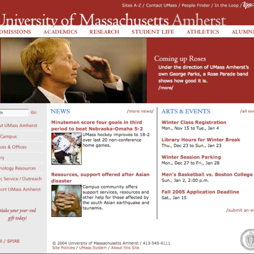
Evolution of UMass Amherst Website
This post is a collection of screenshots and descriptions cataloging the evolution of the UMass Amherst homepage from 1997 to 2009, with pros and cons of each iteration.
-

On “Harsh Truths” and Excellent Advice
Sometimes other people can put your thoughts into words better than you can. Jeffrey Zeldman and Smashing Magazine have absolutely nailed this one. Smashing’s latest article, 10 Harsh Truths About Corporate Websites is spot-on and near-flawless. Read it. Learn from it. Heed its advice. Now if we could just get the corporate world to listen […]
-
On Back-End Beauty
In a “web 2.0” age, anyone who knows what to look for in a well-functioning website will give a subject site the ol’ once-over, and just as quickly, hit a few familiar keystrokes and peruse the site’s source code. Of course, with Ajax-based web apps gaining in popularity, “source scoping” is becoming a futile effort. […]