It’s hard to recall in 2015 what building websites was like in 2004. Need a reminder? 2004 would be remembered as the year that everything began. And while EPIC 2014 got plenty of things wrong, rewatching it now in 2015 is a stark reminder of where we came from. The web was very different 11 years ago.
That’s where I got my start—the chaotic gold rush of new ideas still sore from the burst .COM bubble. But in 2003-4, the web became friendly. Gone were the requisite white lab coats and Ph. D’s. In came artists and designers who saw the web’s potential to touch people.
I give my alma mater credit for embracing the friendly, user-focused approach to the web early on. I’ve written before about UMass’ main website’s evolution. This post is an homage to one of the university’s many microsites—YouMass.
[blog_stripe]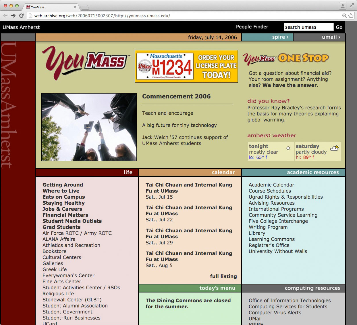
In 2004, websites were all boxes.
In a lot of cases they still are. But in 2004, there were almost no exceptions. That’s mostly because we were still in the dark ages and everyone used HTML tables for their layouts. Smartphones didn’t exist, 1024 was the biggest resolution any real person could get. (In fact my first job in 2007, we still designed sites for 800×600 because browsers didn’t scale and we were afraid of the dreaded crawlbar. 800×600 in 2007! But I digress.)
YouMass was no exception. Boxes everywhere. Three-column layouts were all the rage. 1024 isn’t enough real estate to fit many things unless they’re tiny and unreadable, so tall, narrow columns were king. The early/mid-2000’s were also host to lots of “below the fold” paranoia. We hadn’t learned to shake the old medium’s habits yet.
[/blog_stripe]Shall we count the ways?
Just a few of the elements and components that made (make?) me fall in love with this website. These elements are just as important today. In my teens/20’s, I couldn’t articulate them. All I knew is that I loved this site. Here’s why.
Typography
Part of what appealed to me about YouMass was how friendly it looked. That friendliness, I would later learn, was due in large part to sans-serif typefaces. UMass had policies in place for many years that all official university web pages should use Verdana as their font. They had another font—Frutiger—which was to be used whenever possible. Verdana was the web-standard font used in its place.
Look at the “life,” “calendar,” “academic resources” headings. Set in soft, antialiased white. Lowercase Frutiger in dark-shaded backgrounds. To my 20-year-old, fledgling designer eyes, they were perfection.
Colors
Look, ma! No maroon & white! Ok, a little maroon & white. But there’s, like, other colors too! The concept of tasteful whitespace was still a long ways off. Different colors differentiated topics quickly and easily for users. Still a very useful UX method.
It even has a subtle, in-set drop shadow below the date bar at top! No one was doing that in 2004!
Layout
This is probably the epitome of 2004 layout design. Three content columns with a full-width column across the top, divided into sections matching the width of the columns below. Simple to accomplish with tables, and very effective for information distribution.
Visual priority was easy to read. Important links appeared first but were small enough to hide when not needed. Branding was unmistakable and consistent. Content elements were easy and pleasant to skim. Again, 2004 perfection. Keep in mind, it was being compared to this.
[blog_stripe]
History can’t be judged.
It’s impossible to separate ourselves from the present and its lens. We can’t look at 2004 as it was. We can only see it as it is compared to now. Today, the YouMass site would barely pass. But in 2004, for this humble webdev anyway, it was beautiful and inspiring. So much so that I’m still praising it 11 years later.
By the way, please check out the original EPIC 2014 Flash movie if you’ve never seen it. It’s still as eerie today as it was when it was published.
[/blog_stripe]
Aww, shucks, TJ. Thanks! This was one my favorite projects at UMass. In fact, the little banner ad space at the top center still lives on… I spec’d those ads to accommodate promos for the dining halls. They are STILL creating those promo ads at the SAME YouMass spec today: http://www.umassdining.com/
I had a feeling you were involved in that one! Anyone else I know? And I meant every word. I would stare and marvel at the site way back when. Still get the warm fuzzies of inspired nostalgia.
Lots of memories coming back… I worked with OIT to try and include NetID or SSO login and pull library, Spire and email alerts… we weren’t able to but even the subdomain required a little bit of begging to make happen!