Pinterest uses a layout method called Masonry and it is everywhere these days. Since David DeSandro first released Masonry as a jQuery plugin in 2009, the layout technique has been sweeping the webnation. Great for David. Bad for me.
Pinterest gets away with using what I believe is a terrible layout for general web/desktop UX. I came across a post by Stephen Corwin that made some great points. This one I like best:
The layout works for Pinterest purely because no one goes there looking for something particular.
The layout is not meant for function. It’s strictly aesthetic. Which may make for nice artwork, but for those of us trying to accomplish a goal (other than to zone out and look at pretty pictures), the experience is difficult. The discussion on Hacker News over Stephen’s post seems to agree and provide some supporting hypotheses about why it works for Pinterest.
[stripe html_class=”light-grey”]Visual Priority
One of UX’s central principles is organization of information presented to the user. Steve Krug’s “Don’t Make Me Think” still rings true: present information without causing the user any mental friction. So let’s review Pinterest’s visual hierarchy and organization.
Here’s a screenshot of my Pinterest feed/stream/homepage thing. There are 23 items visible on first load, before scrolling. (If you’re curious, this is on a 17″ MacBook Pro.)
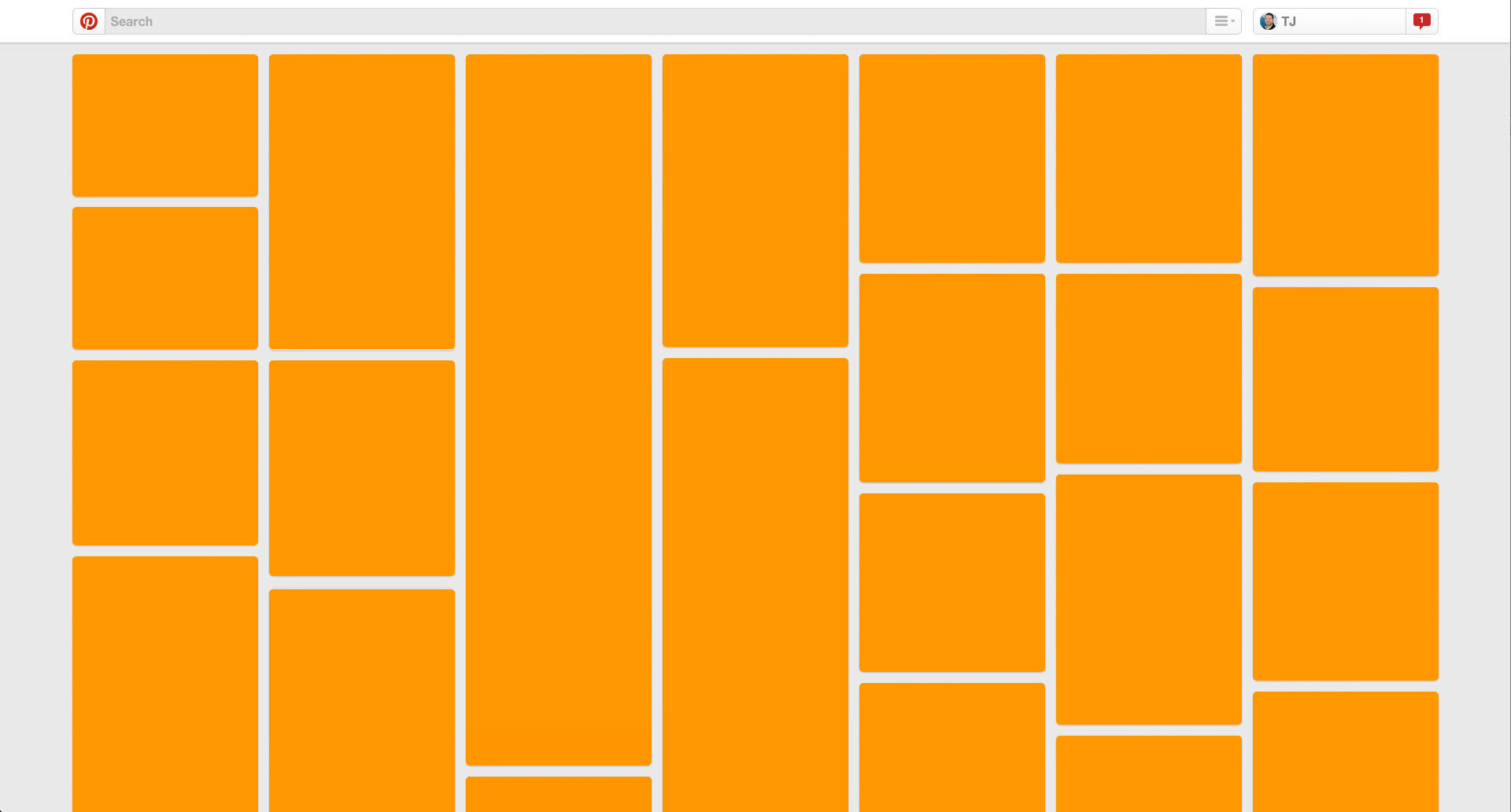
At first glance, these 23 boxes don’t seem too daunting. Different heights and Y-offsets, but pretty manageable. As for priority, I don’t immediately notice any visual indicators. Clearly some are taller than others, but in the English-speaking web, since we read left-to-right primarily, content height is generally fluid. Thus the height of an element isn’t necessarily an indicator of its priority, only its length. (That argument isn’t ironclad, I know, but it’s close enough for our purposes here—I don’t think anyone would argue that they consider taller Pinterest pins more important than shorter ones.)
Without size as an indicator, my only option for determining priority is location. Again with English-speaking web reading left-to-right/top-to-bottom, I’ll go with decades-old habit of starting at top left and F-scanning. Stephen Bradley wrote in 2011 about the Gutenberg Diagram, Z-Pattern, and F-Pattern of user eye movement. The 23-item grid above does nothing to respect any of these major behavior patterns. Thus, location is also unreliable as indicator of priority. Strike two.
Chaos Theory
The inconsistent sizes only get worse when we account for the image-vs.-text within the layout. Now each element has unique total size and image-to-text area ratio. The visual signal here is starting to get very lost in the noise.
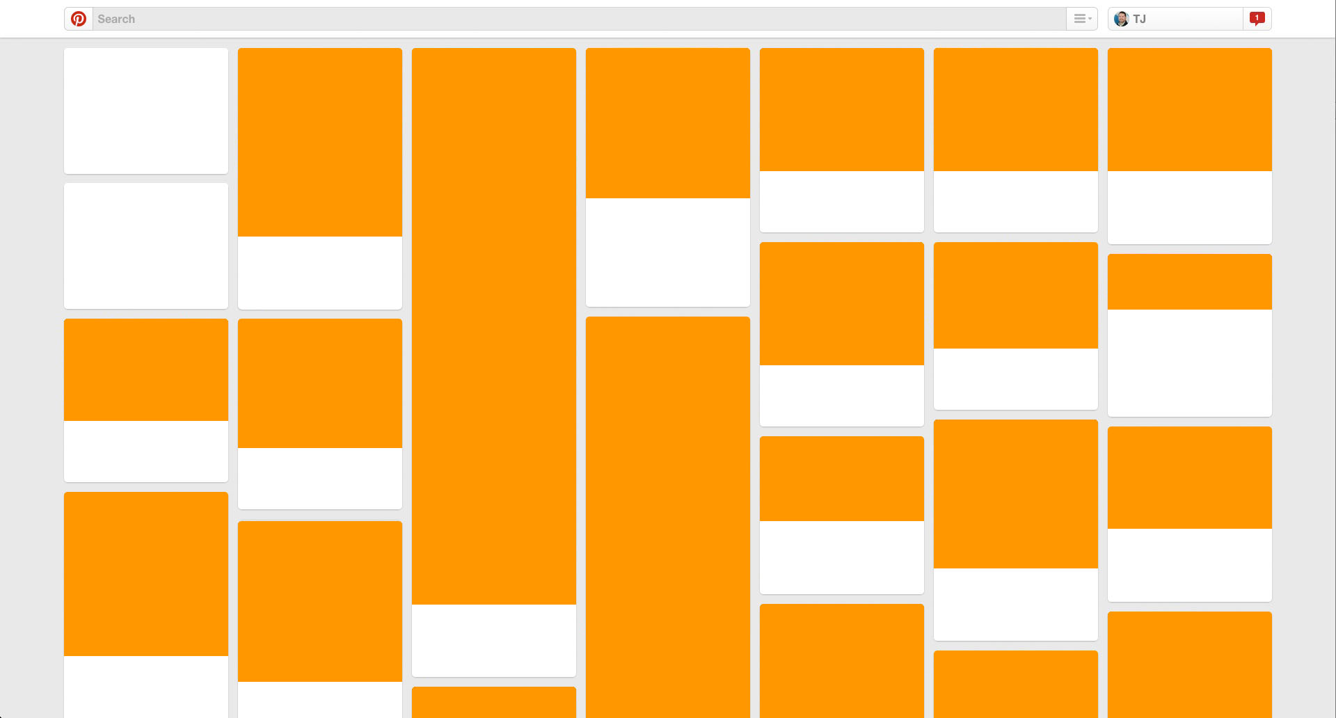
Image-to-text ratio is hard to balance. Text descriptions and content bits rarely have identical lengths. Eating my own dogfood: my site is no exception. Even Twitter, which limits its content to 140 characters, has widely-varied height content blocks.
SitePoint is only one of thousands of examples of sites attempting to make up for the size inconsistencies. It’s definitely better (IMO, of course), but could still be improved.
[stripe html_class=”light-grey”]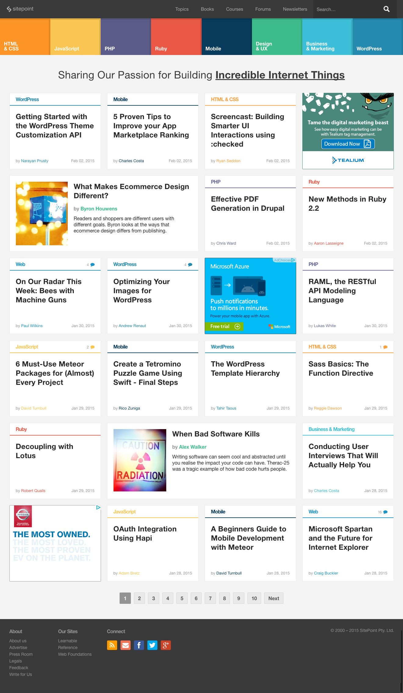
Y-Offset
It occurred to me while preparing screenshots for this post that the Y-offsets of these Pinterest items is clearly demonstrated by Photoshop guides. By my count, There 30 different horizontal lines—either the beginning or end of a block.
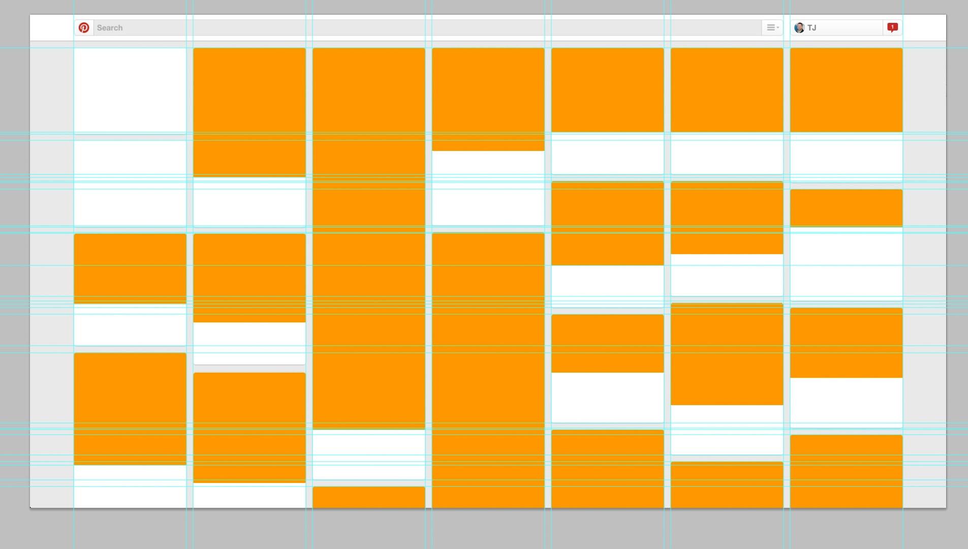
I’m not an eye-tracking expert, but that sounds high to me. And the experience feels uncomfortable to me when trying to use Pinterest. I bet those 30 lines play a major part in that friction.